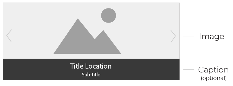
Carousel Banner Component
The carousel banner component displays content in a slideshow-like manner.
Options are available to control the slider order and caption color, as well as the ability to turn off auto-play.
When to use the Carousel Banner component
Use this component to create, add, or update a carousel banner.
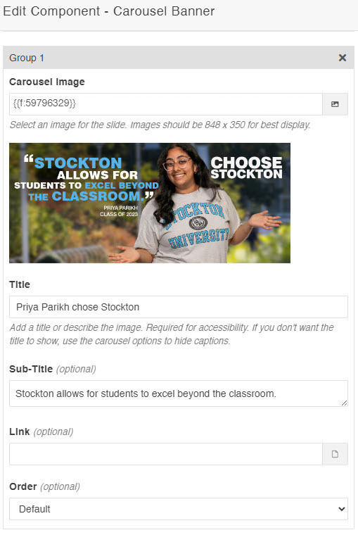
Carousel banners require a general description of the carousel and titles for each slide image. The carousel description and image title are required for accessibility. Image titles can be visually hidden by toggling the "captions" drop-down to "hide."
The slide order can be controlled by the "order" drop-down field available for each slide.
Usability guidance
This component will only allow for images at the following dimensions / aspect ratio:
- 848 x 350
- 1400 x 600
Images outside these dimensions will be automatically cropped to fit to ensure size uniformity across all slides. Contact the web support team if you need help with image sizing.
Example Carousel:
This carousel banner component consists of two slides with captions hidden and auto-play disabled.


Previewing images after adding a slide
Images that are uploaded into the carousel banner component will appear once the target server is set to staging or the page has been published.
Implementation
- Open a page in Modern Campus CMS and enter editing mode.
- Place your cursor where you would like to place a carousel banner.
- From the toolbar, select the component icon
 , which resembles an atom symbol.
 - From the list of components, select the Carousel Banner component.
- Fill in the required fields and select your options.
- Save and preview.
